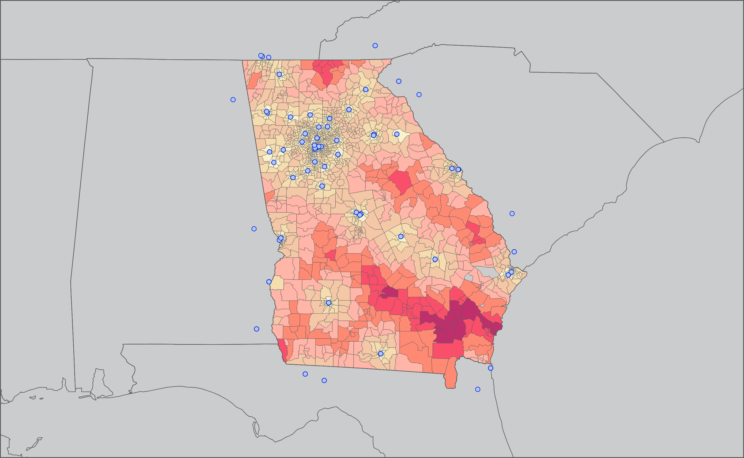
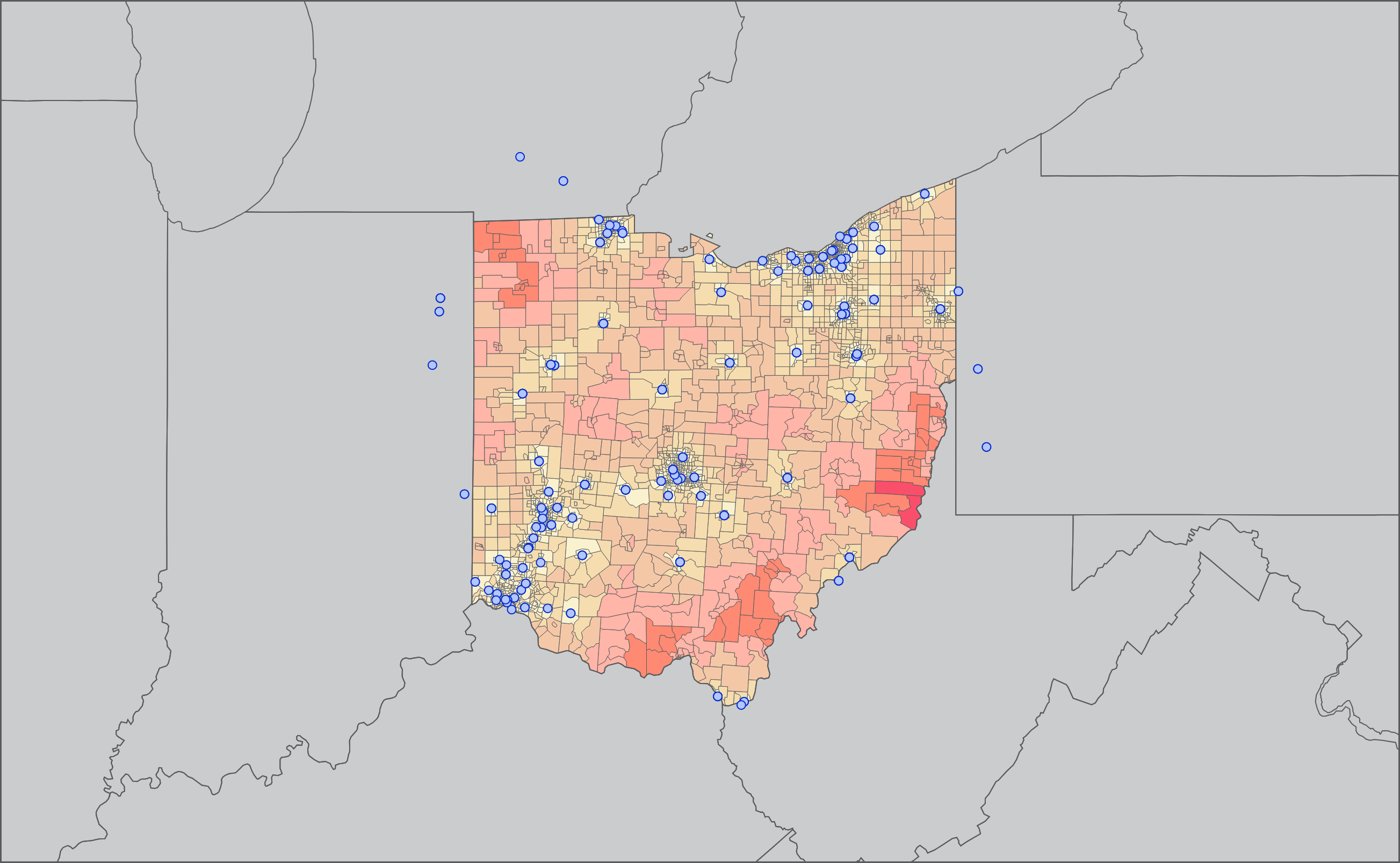
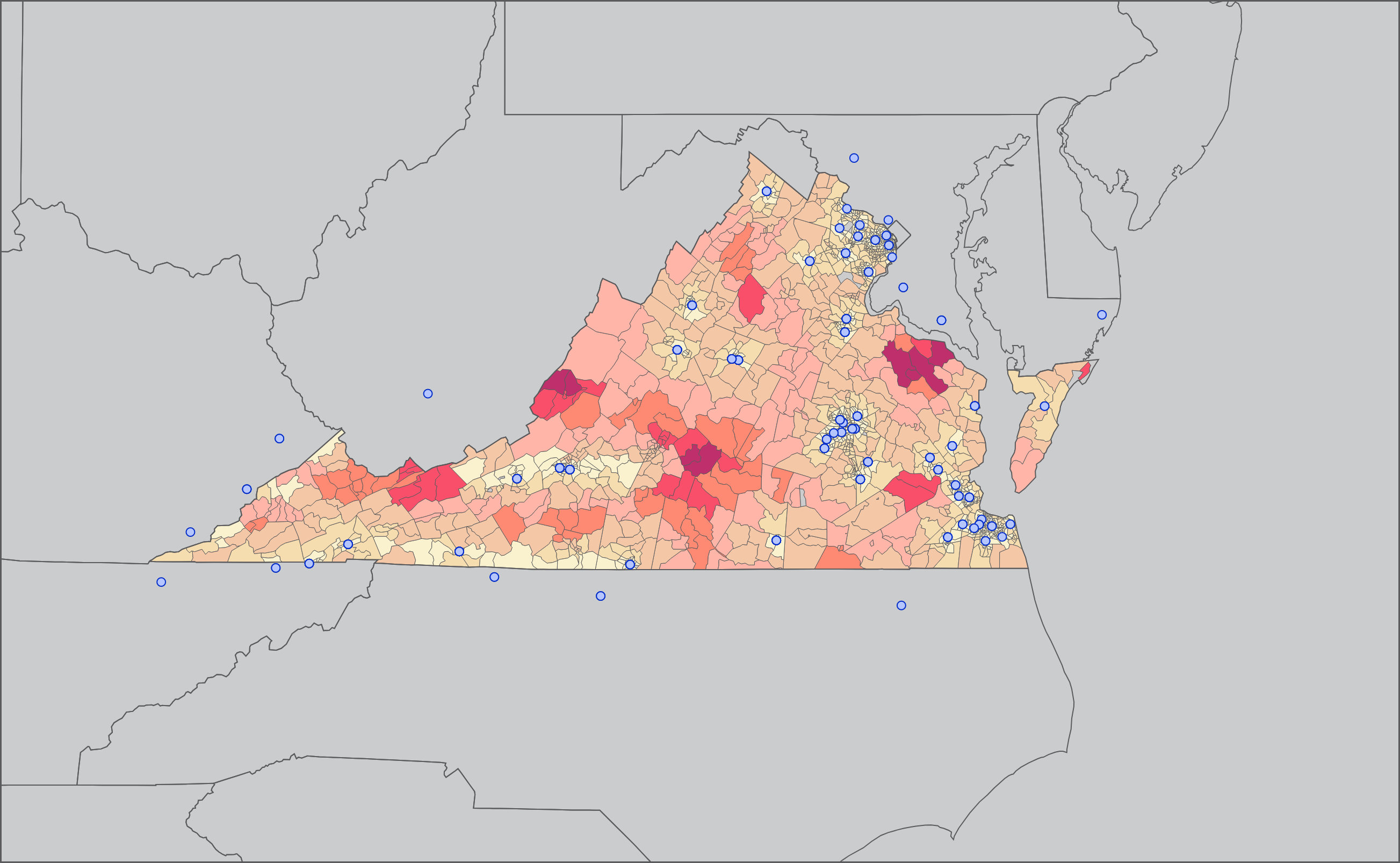
You're having a stroke. How far do you need to drive to a hospital?
Tim B. Z.
You can read the full manuscript for this project here.
In 2021, I collaborated with physicians to examine driving distances to stroke centers in the United States. It was a really neat project at the intersection of public health and visualization. I got to create a set of demographic risk models, road network tools, and map visualizations, as well as systems to collect data and iterate analyses.
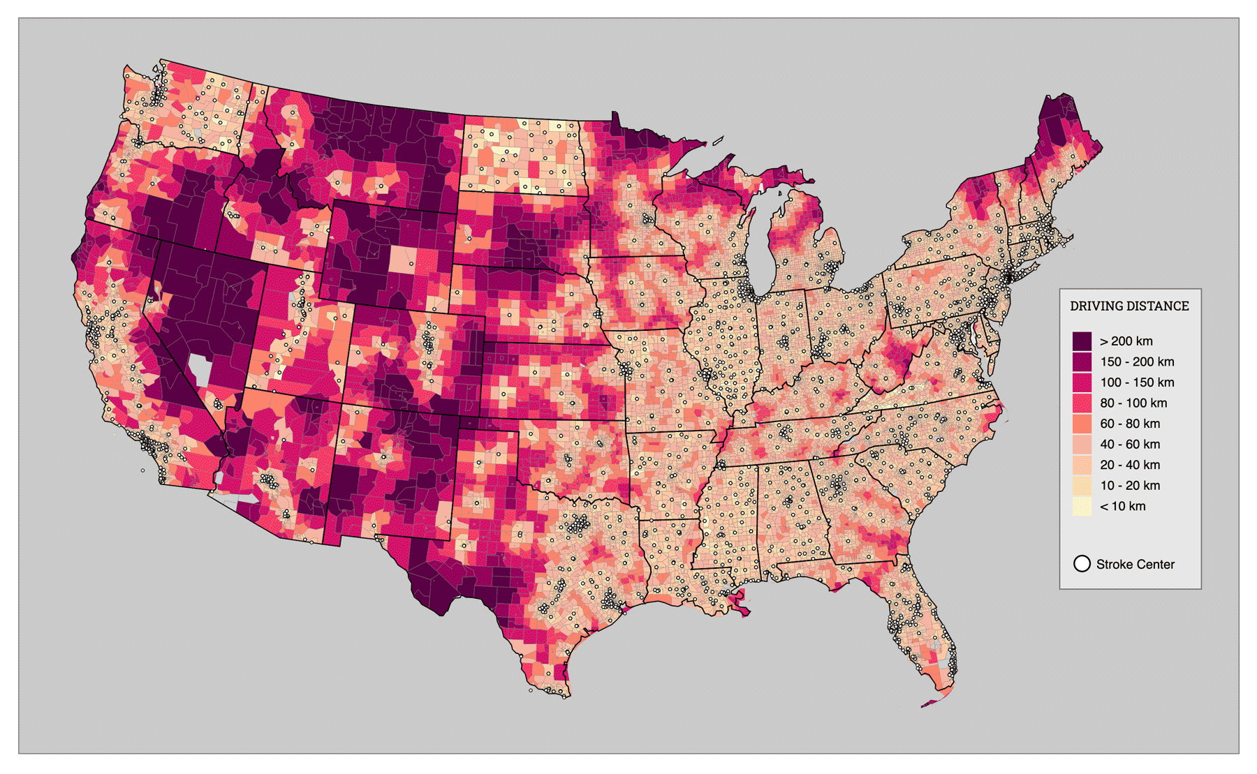
This map of the contiguous United States depicts how far a person must drive to reach their nearest stroke center. We created this visualization by combining spatial data from the U.S. Census, open source street network graphs, and a table of stroke certifications and hospital locations.
First, the bounds of each state were determined from public data. Bounding boxes of 1-radian were drawn to encompass instances where people might cross state bounds to receive care.
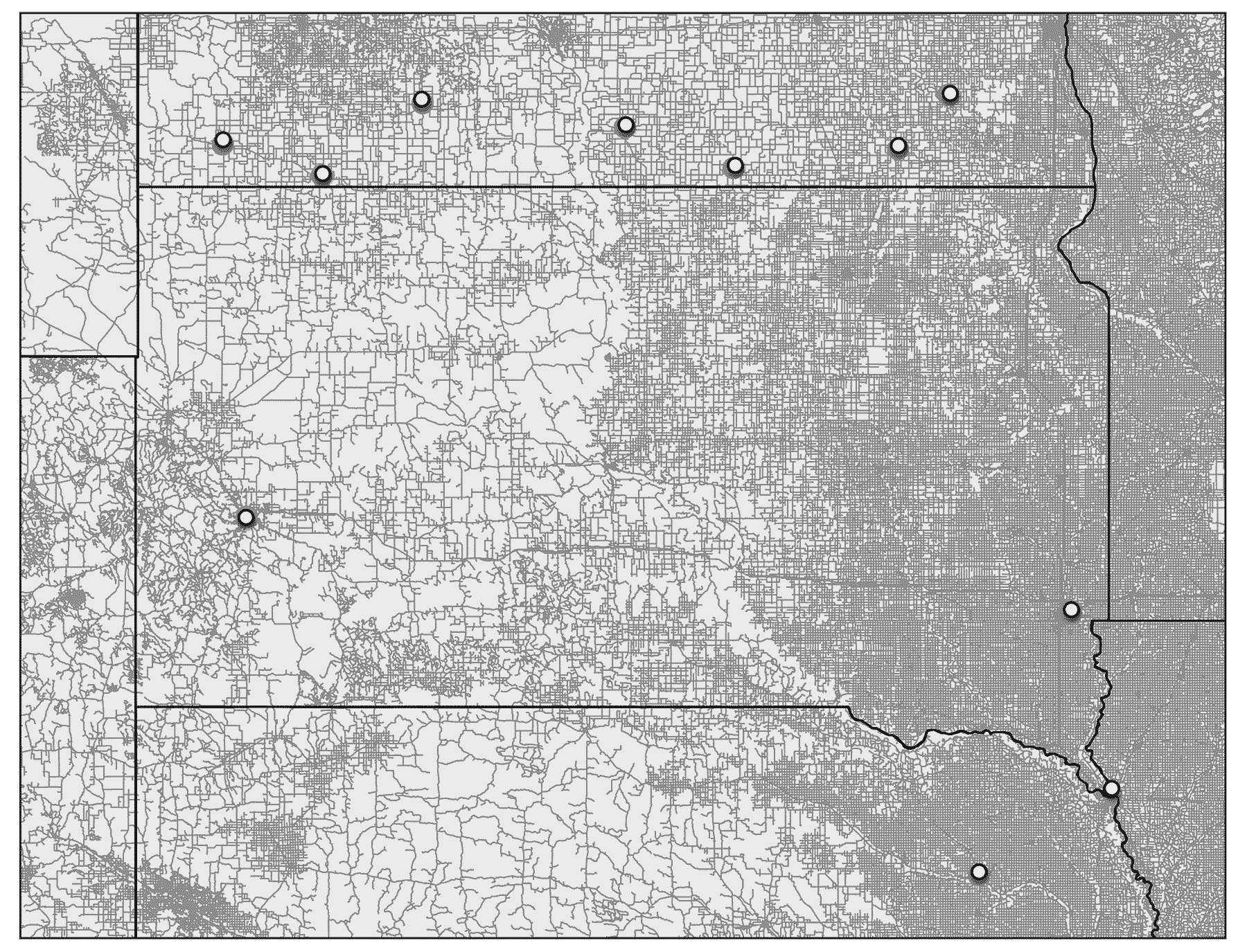
Then, a road network for each state was extracted as a graph object from OpenStreetMap using OSMNx. For example, this visualization depicts all of the roads and stroke centers in South Dakota.
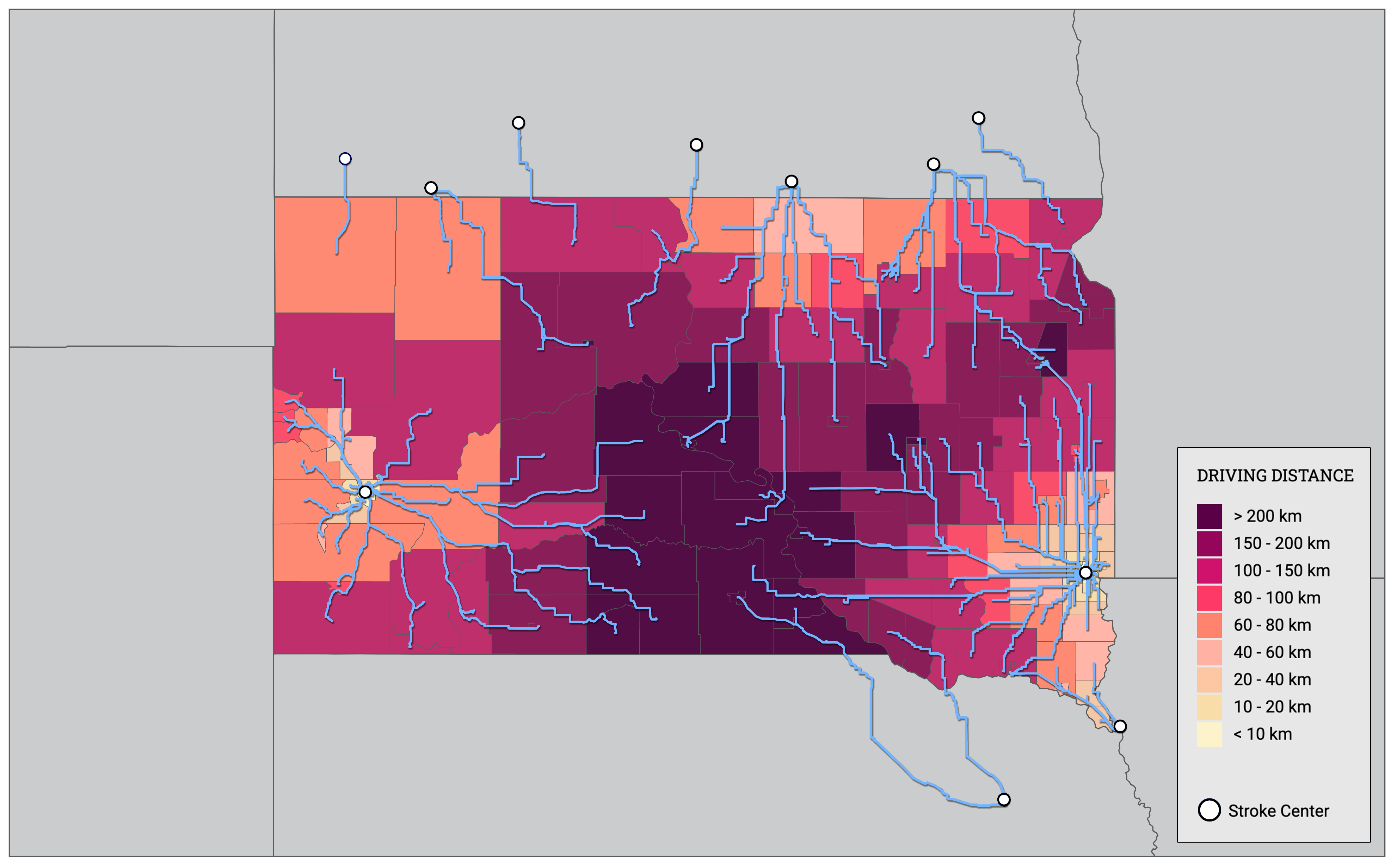
After identifying each census tract's population-weighted centroid, we wrote an algorithm to find the hospital closest by driving distance (blue lines).
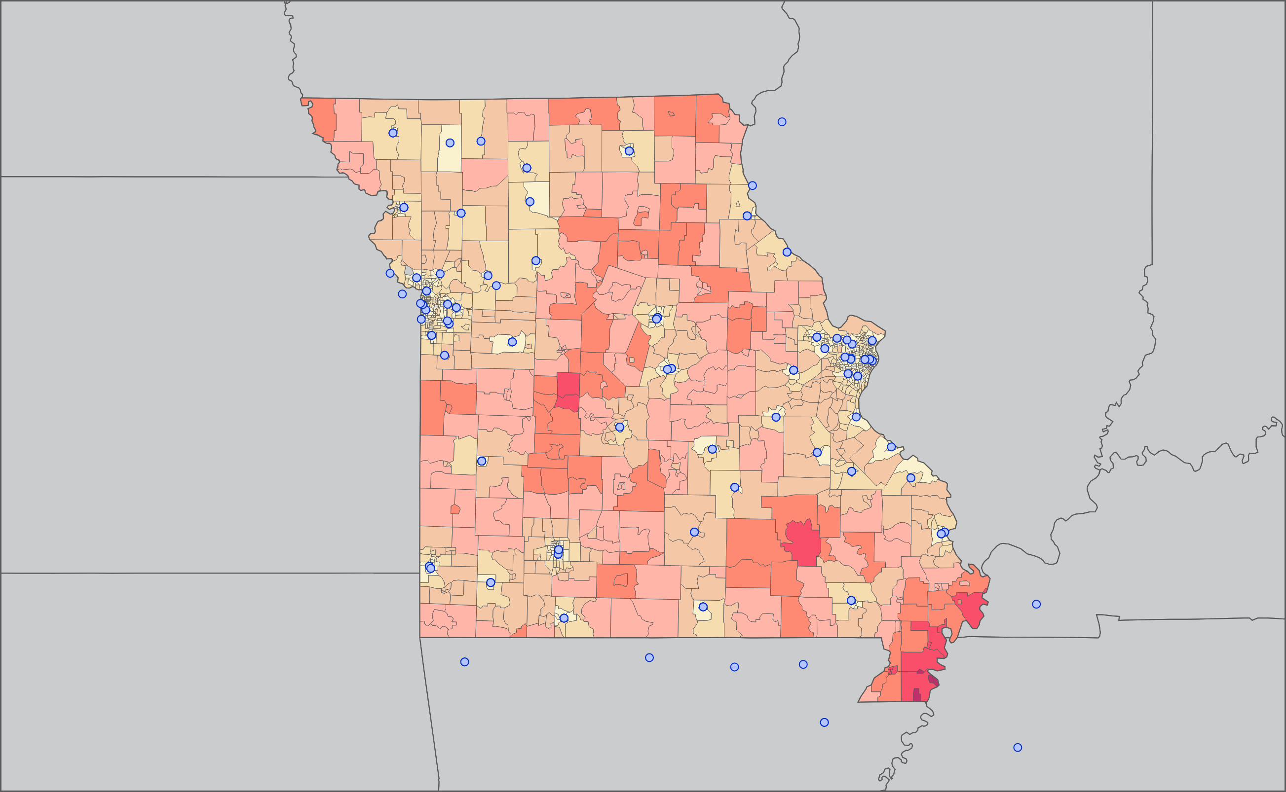
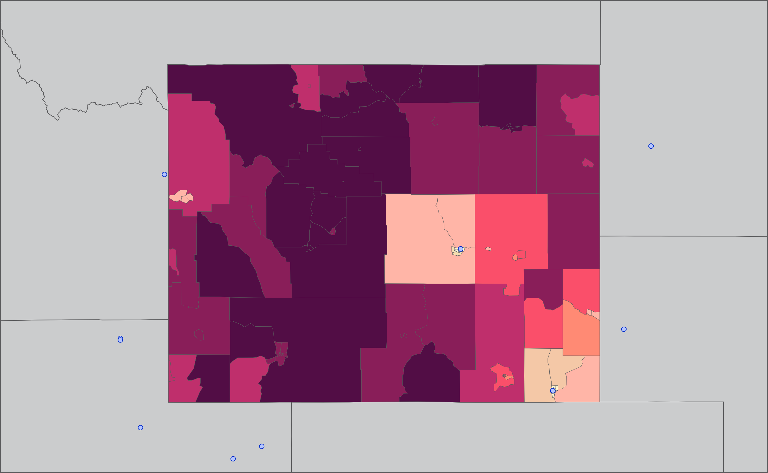
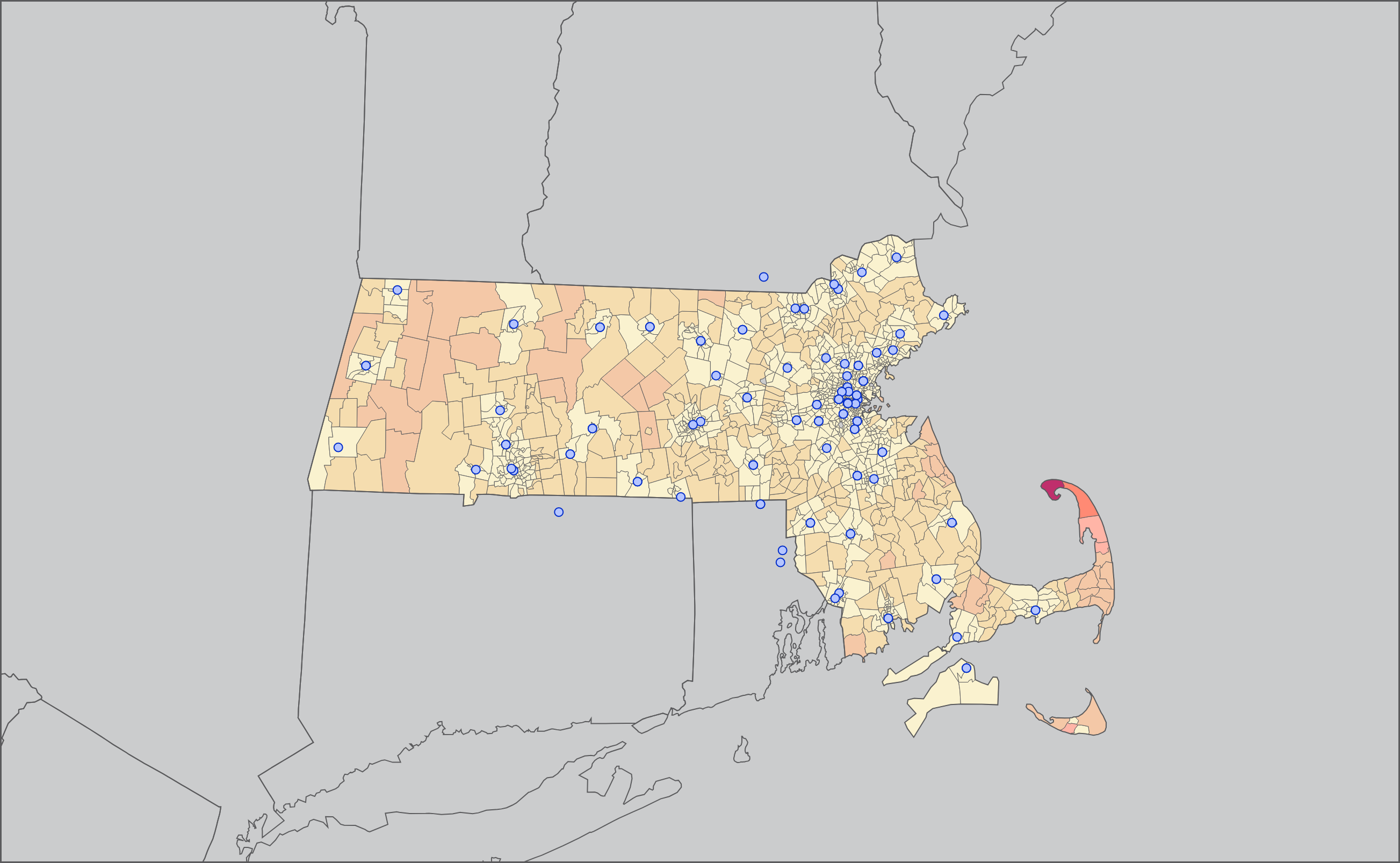
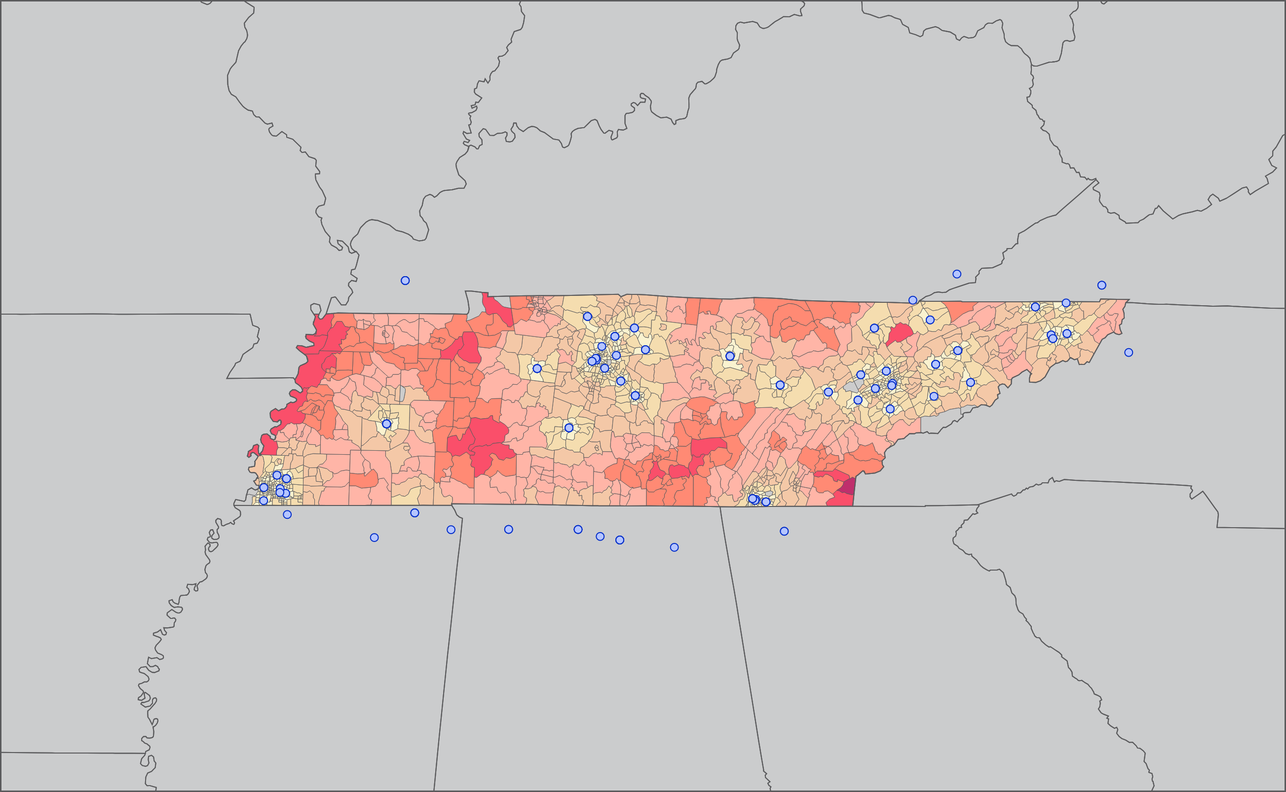
Census tract shapes were overlaid on the graph and colored according to these distances. Tracts in red and dark red signify distances of an hour or more by highway.
This produced interesting results as we repeated the process in each state. Here are a few selections:
